Tuesday, 6 April 2021

Artist: Pablo Auladell


In this post I discuss Pablo Auladell; specifically, his adaptation of Paradise Lost (featured art is from the first canto of the book).


I really like his use greys and blacks: charcoal, by the looks of it. The light falling on skin is always varied, giving figures and subjects depth. Naturally, the captions from the original poem only add elegance to the entire work. They’re all in caps, and a serif-style font. 


His use of repeated panels on page 34 is interesting. Auladell is repeating the bottom panels, changing only the figure, leaving the mountaintop the same. It’s smart for saving time but also for sequence; the “adversary” is still speaking here; breaking up his dialogue in panels like this makes it feel like he’s piecing his thoughts together: he’s still reeling from being hurled from Grace, so he’s still piecing his thoughts together: stitching together his doomed forever mission. Denial is quite a thing; madness has its wonders.


The adversary giving one of the rebels the bull’s head is clever as well. God crafted the world to be beautiful, and the adversary is contorting God’s vision. The adversary’s pride is unending: in his arrogance, he’s adding discord to God’s music, thinking he can do better. 


I like how Beelzebub is standing behind the adversary here, too. A sidekick, listening and reacting to the speech. Plus, the way they fly to the mountaintop is cute: and, it’s the same mountaintop from before.


Speaking of flying, that has charm as well. It’s not a dynamic Superman flight, but still carried lots of energy. 


The colours of the font are nice here, too; binary black and white. These letters were repeated using computer tech; replicating layers, I think. It gives it consistency in size and shape, but also shows planning: as such a prolific illustrator (he averages four books a year) he’d know that his work would be published in other languages.  


Auladell demonstrates further clever use of panels, like here, when depicting Death. With a skull face and strung-out figure, Death naturally unearthly looking, and breaking him into pieces via panels contributes to this effect. Death is also aggressive, contributing to his intimidating presence in the book, but I really love how the only thing he fears is the Son who is fated to destroy him.


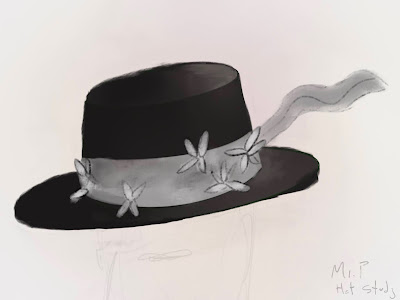
…And, as a semi-aside, I really like this hat. It’s not a crown per se, but it functions to set him apart from the other rebels. 


Auladell added the same spread of bright values across the band of the hat, giving it variation of hue, and then drew simple black lines over it; the flower petals. It’s clever and effective. The hat also is very black, which is appropriate: wouldn’t the adversary wear a black crown? The hat also makes him look like a traveler, with its flowing banner, which again suits him, as Paradise Lost is written, in part, in the form of an epic poem.


I liked the hat design so much I did a quick study of it. Looking at it, I see I should use charcoal brushes: brushes with spotty or grainy textures when striving such a style.


Sunday, 14 March 2021

Interesting: M.A. in Expressive Arts Therapy

 Interesting: http://expressivearts.egs.edu/ma-in-expressive-arts-therapy  

From their website:

M.A. in Expressive Arts Therapywith a Minor in Psychology

Expressive Arts Therapy is an intermodal field combining the study of health, illness, resilience, and the Arts. Through the process of Art-making, an Expressive Arts therapist discovers how their clients can live in a better way, how the Arts facilitate change, personal growth and transformation.

Indigenous cultures have often been cited as combining ritual, community and the use of the Arts for the purpose of healing and such practices have endured throughout the centuries. Through its intermodal approach, Expressive Arts Therapy integrates different Art modalities within a therapeutic context. Its roots are based in philosophy, anthropology, psychology and the Arts. The use of the Arts in Intermodal Decentering IDEC® is fundamental to the therapeutic process.

Expressive Arts Therapy has, as its foundation, the practice of the Arts and our response to this innate quality. This creative process supports us to respond and to shape our world in a way that is life-giving and healing. The intrinsic human capacity to create is at the centre of the therapeutic work and thus the creative urge becomes stronger than illness, disease or psychic disorder, empowering the client to come in touch with their inner strengths and gain insight on how these resources can impact and transform the larger disharmony.

This Program is ideal for professionals, artists and anyone who wants to engage with the Arts to work as change agents with clients, using the process of Art making to improve the quality of life for people with disabilities, psychic disorders, and disharmony in their personal life. This degree is beneficial for those wanting to work in hospitals, children's programs, or in other therapeutic setting. Students will learn how to be prepared for unexpected situations, advance their cultural and professional communication skills, and connect with masters in the field.


Tuesday, 2 March 2021

Artist: Akira Toriyama

I was never the biggest manga fan, but the value of Akira Toriyama's work is obvious.   

Toriyama is the comic artist most known for creating Dragon Ball. You can see his personality reflected in his art.

Dragon Ball is still fantastic because, apart from its great art, it never lost its light and humourous roots. Check out Dragon Ball before the "Z." The same kind of boyish adventure as knights on quests to slay dragons, or pirates and astronauts exploring sea and space. 

I love Toriyama's style for its optimistic energy. DBZ had its moments of intensity (Future Trunks springs to mind; he and his story was always too edgy and angsty for my liking) but despite all of the dramatic battles, when I think of Dragon Ball, I think of lightness, if that makes any sense. 

Look at the smiling faces, confidence, and energy in the image above. There's real "flow" to it, and not just how the elements of the drawing are arranged to lead the eye. 

The airplane exudes charm, too. Toriyama chose not to draw anything sleek, dangerous, or overtly powerful looking like a jet; he has real love for "analogue" tech: big, chunky vehicles filled with personality. Toriyama loves drawing vehicles and devices so much and so often I've wondered if he has training in industrial design. Plus, just like his characters, Toriyama's vehicles have distinctive design. Look at the rounded "capsule" look in the following image to see what I mean.

I also love Oolong's "worker" uniform, complete with cap.

Terrific Tanks: I loved reading "Sandland" when I was a boy. Everyone got around with tanks, and the mechanical design was equal parts futuristic, functional, worn, and charming: essential elements for contributing to a story's charm and soul, as well as mechanical design. 

A famous one, and a favourite. Toriyama seems fond of drawing Goku, his flagship character, riding motorbikes.

Toriyama fully deserves his success, because he is a genuine artist: a superb storyteller who enjoys drawing for drawing. The detail he puts into his work happens to be impressive; it's not injected to impress. And while there's an intensity to it (check out the detail on that bike!) it's not cranked to an uncomfortable degree, like the art of another manga series, Berserk.  

Episodes of Dragon Ball are still being made to this day, including movies and a TV series; "Dragon Ball Super." I had a vacation recently and, in perusing art sites, saw art of the new characters populating the new series (leading me to reflect on Toriyama's art, hence this blog post). I can't say I'm especially impressed by "Super," most probably because they're not done directly by the man himself. But after seeing a few clips of this new series you can tell Toriyama has a role in the creative direction of the show: specifically, its light tone. (And good for him for keeping it so: after all these years, if the show was intense or took itself too seriously it'd be embarrassing.) 

While the art of "Super" isn't fantastic, it prompted me to look up clips of DBZ, something I enjoyed from childhood. There were three major "sagas" to that program: the Saiyan Saga, the Cell Saga, and the Buu Saga. All were good, but my absolute favourite is the original Saiyan Saga. The art, at this point, had become less round from the Dragon Ball days but has not yet morphed into the ultra-angular style that would come to define current iterations of Dragon Ball, like the design of our angsty friend, Future Trunks. By the time of the Buu stories, the art process had become streamlined, but in these early days, there was a more "organic" feel to the art. 

Check out these designs of Vegeta to see what I mean. 

Early DBZ still had intense moments like this one, but they were rarer, making them more dramatic.


I mentioned "flow" and energy earlier, and I get the same feeling from Vegeta's early design, especially in this last one. It's organically drawn; not yet (overly) streamlined, copied from a computer scan, or too angular. The neck muscles, small nose, and black hair make him look young, but also strong. The armour too contributes a special charm; it's science fiction-y in an antiquated, "Flash Gordon" kind of way. (The Saiyans were invading, evil aliens, after all...)

Vegeta was an expressive and iconic character, and Goku, too: I know there're still stories being told with them as the heroes, but only this early part of Dragon Ball strikes me.  

Anyway, those're my thoughts on Akira Toriyama: iconic and genuine artist.  

"Signature" Signatures

I'm not the a big fan of manga, but I do like Manben's "signature signature" (and no, that's not a typo). 

Check it out: 


...As far as I can tell, Manben signs most of his work with these cool little pictogram-signatures. They're stylish and, given his talent and career, earned: that is: not pretentious. An amateur (with any level of self-awareness, anyway) couldn't get away with signing his work with signatures like these because, apart from not being "earned," he'd be a dilettante: he would not yet have the skill to nail down the charm. 

Mike Mignola, meanwhile, still signs his work with a simple "M" with a box around it...

See the "M" in the white box?


...and Vincent Van Gogh signed his work, simply: "Vincent."


Van Gogh suffered with mental illness for much of his life, but there was a time where he worked as a preacher, and Christian faith values humility. Signing his work with his first name strikes me as a humble act, somehow. 

Ironic, then, as he's so celebrated today.